| GIS | |
A Power-Law-based approach to mapping COVID-19 cases in the United States
Mapping the ht-index of COVID-19 cases against that of populations shows that the pandemic is largely shaped by the underlying population with the R-square value between infection and population up to 0.82 |
 |
|
 |
|
This paper examines the spatial and temporal distribution of all COVID-19 cases from January to June 2020 against the underlying distribution of population in the United States. It is found that, as time passes, COVID-19 cases become a power law with cutoff, resembling the underlying spatial distribution of populations. The power law implies that many states and counties have a low number of cases, while only a few highly populated states and counties have a high number of cases. To further differentiate patterns between the underlying populations and COVID-19 cases, we derived their inherent hierarchy or spatial heterogeneity characterized by the ht-index. We found that the ht-index of COVID-19 cases persistently approaches that of the populations; that is, 5 and 7 at the state and county levels, respectively. Mapping the ht-index of COVID-19 cases against that of populations shows that the pandemic is largely shaped by the underlying population with the R-square value between infection and population up to 0.82.
Introduction
The novel coronavirus COVID-19 has rapidly spread around the world and triggered an unprecedented pandemic in the few months since January 2020. At the time of writing this paper, over 34.2 million people globally had been infected, with over 1 million deaths, and the situation is still developing. How to better understand the spread mechanisms of the coronavirus in space and over time across different levels of scale concerns many scientists such as geographers, cartographers, and epidemiologists. Many previous studies have already examined the spatial distribution of COVID-19 cases using conventional geographic information systems (GIS) and mapping methods such as hotspot and time series analyses (ESRI 2020). These methods are developed essentially under Gaussian statistics (Jiang 2015) with the assumption that data varies around a characteristic mean (e.g., 1.75 meters as the characteristic mean for human height). A common problem of these methods is that the resulting spatial patterns are sensitive to human subjective decisions like parameter settings. For example, either the number of classes or class intervals has to be decided subjectively. In contrast, we adopt a power-law-based approach under Paretian statistics for examining spatial and temporal distribution of COVID-19 cases in the United States.
We examine the spatiotemporal distribution of all COVID-19 cases in the US across multiple scales of space and time. In space, there are two levels of scale – state and county – whereas over time there are three levels: monthly, weekly, and daily. We detected a power law distribution ( y = kx-a+m, where a is called power law exponent between 1 and 3, and k and m are two constants.) for each of three parameters: population, infection, and death. All these three parameters demonstrate power laws with cut-off, despite of some fluctuations for both infection and death. The power law indicates that these three parameters bear an inherent hierarchy or spatial heterogeneity, with far more small events than large ones. To derive this hierarchy, we used head/tail breaks (Jiang 2013) so that each state or county is assigned a htindex for each of these three parameters to indicate its hierarchical level. The derived hierarchical levels provide new insights into the development of the pandemic for individual states and counties relative to their populations. For example, the pandemic is largely shaped by the underlying population with the R-square value between infection and population up to 0.82. The power-law-based approach enables us to see spatiotemporal patterns that the conventional methods are unable to discover.
The approach has a profound implication on power-law-related research in terms of whether data exhibits a power law or any other similar distribution. That is, from a dynamic view, power law is usually observed when a complex system is fully developed, before which the system is likely to exhibit other less-power-law distributions such as lognormal and exponential. For example, there is little doubt that a tree as a complex biological system demonstrates a power law distribution for its trunk, branches, and leaves, because there are far more leaves than branches, and far more branches than trunk. However, the tree is unlikely to hold a power law at the stage of the germination of the seed. We will further discuss this implication before the conclusion.
The remainder of this paper is structured as follows. Section 2 introduces the data source initially collected by Johns Hopkins University, and the head/tail breaks illustrated by a simple example of the 10 numbers. The power law detection is based on the maximum likelihood method (Clauset et al. 2009), arguably the most robust statistical test. Section 3 presents our results and discussion, as well as an animation map (http:// lifegis.hig.se/COVID19/). Section 4 highlights the implication we briefly mentioned above. Finally, Section 5 draws a conclusion of this paper and points to possible future work.
Data source and methodology
Over three million people have been infected and 208,000 people have died from COVID-19 in the US from January to June of 2020. Johns Hopkins University (2020) has gathered this data and published it on the GitHub website. This data is compared with the country’s population at both state and county levels. In general, the two parameters – infection and death – are highly related to population. Like the population in the US, the numbers of infection and death are highly concentrated in a few wellpopulated states and counties. In this study, we intend to compare COVID-19 cases against the underlying population, in order to develop new insights into spatiotemporal patterns of the pandemic from the multiple scales of space and time.
Like all countries, the US population is not evenly distributed, and it has a very high degree of concentration in a few cities, states, or counties, the so-called inherent hierarchy or spatial heterogeneity. At the city level, this kind of spatial distribution is usually characterized by a power law distribution, such as Zipf’s law (1949). Zipf’s law states that in terms of population the first largest city is twice as big as the second largest, three times as big as the third largest and so on. At the county level, the top 20% counties accommodate 80% of the population – the so-called 80/20 principle (Koch 1998) that is credited to the Italian economist and polymath Vilfredo Pareto (1848–1923). What is behind Zipf’s law and the 80/20 principle – or the power law in general – is the inherent hierarchy or spatial heterogeneity, which can be illustrated through the head/tail breaks classification scheme (Jiang 2013). This is a recursive function that can be used to derive the inherent hierarchy of data with a heavytailed distribution. The derived hierarchical levels or classes reflect the recurrence of far more small numbers than large ones, or spatial heterogeneity, characterized by the ht-index (Jiang and Yin 2014).
Unlike conventional classification methods, with which the number of classes or class intervals are subjectively determined, head/tail breaks adopts the wisdom of crowds thinking (Surowiecki 2004), through which both the number of classes and class intervals are objectively determined by the data; in other words, the data speaks for itself. Head/tail breaks is recursive function, through which a dataset is conceived as the head of the head of the head and so on, and all the tails and the last head constitute the derived classes or inherent hierarchical levels.
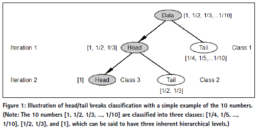
To further illustrate the recursive function, let us use a simple example of the 10 numbers (1, 1/2, 1/3, … 1/10), which follow exactly a rank-size distribution in the so called rank-size plot in which the x-axis is rank, while the y-axis is size.
Strictly speaking, these 10 numbers cannot be said to be distributed according to Zipf’s law, for it is a statistical regularity. Instead these 10 numbers (1 + e1, 1/2 + e2, 1/3 + e3, … 1/10 + e10) (where is a very small value epsilon) are said to fit Zipf’s law. Back to the first 10 numbers (Figure 1, Jiang and Slocum 2020), its average is 0.29, which partitions the 10 numbers into two groups: those greater than the average (1, 1/2, 1/3) called the head, and those less than the average (1/4, 1/5, 1/6, … 1/10) called the tail. For those in the head (1, 1/2, 1/3), their average is 0.61, which further partitions the three into two groups: the one greater than the average (1) called the head and those less the average (1/2, 1/3) called the tail. The number of iterations or the notion of far more smalls than larges occurs twice, so the ht-index is three, indicating three inherent hierarchical levels. As shown in this example, the head percentage is far less than the preset 40%. The 40% is a very loose condition for something to be a minority to meet the notion far more smalls than larges.
In this study, we detect power laws using the robust maximum likelihood method (Clauset et al. 2009), calculate the ht-index for all COVID-19 cases in the US, and compare these calculated parameters with those of the population at both state and county levels along the time dimension. This type of comparison provides new insights into the spatiotemporal patterns of the pandemic. Before getting into the results, we would like to make one point explicitly clear about power law exponent a. It is a good indicator for heterogeneity of data: the higher the exponent, the more heterogeneous the data. For example, given two power laws, y = x –2, and y = x –3 , the one with the exponent 3 is more heterogeneous than the one with the exponent 2. Throughout our study, we will show that the ht-index is a better indictor than the power law exponent for characterizing the data heterogeneity.
Results and discussion
The population of the US looks like a power law distribution at both state and county levels, as shown in Figure 2, but they are power laws with an exponential cut-off, strictly speaking. It is pretty the same for both infection and death gradually developing towards power laws with cut-off as time passes (shown as light blue and light red to dark blue and dark red). In March or before early April, both infection and death exhibit moderate power laws, while after April they are power laws with cut-off. As an example, Table 1 shows that how death at the county level demonstrate a power law or a power law with cut-off with detailed statistics.
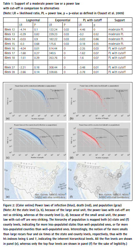
The likelihood ratio (LR) (Clauset et al. 2009) can be used to determine power laws or power laws with cut-off hold in comparison to its alternative heavy tailed distributions such as lognormal and exponential. As a rule, a positive LR favors the power law fit, while a negative LR says the alternative fit. On the other hand, the LR is trustworthy if the statistical fluctuation of LR is relatively small. Therefore, an additional p-value is defined to the LR is trustworthy statistically (Clauset et al., 2009); if p < 0.1, then the LR is trustable.
At the state level, the LR is not statistically significant as the p-values are too high, therefore we cannot be certain that either of the distributions is a better fit. This is likely due to the small sample size (n = 51). At the county level with the large sample (n = 3262), the alternative lognormal distribution is more likely than the power law distribution for most of the weeks. However, the support for power laws with cut-off are even more likely than the lognormal distribution. In the end, power laws with cut-off are more likely than the lognormal and exponential distributions.
The log-log plots in Figure 2 indicate that the overall spatial distributions of infection and death are very much shaped by the underlying population. That is, those populated states and counties tend to have far more cases of infection or death. This is of course not out of our expectation, since the more the population, the more likely the infection or death. Given the power law distribution of the population and by applying the head/tail breaks, we derive ht-indexes of 5 and 7 at the state and county levels, respectively. In other words, the population is automatically classified into 5 and 7 classes, as shown in Figure 2 (e, f). These two patterns regarding population at the state and county levels reflect the patterns of COVID-19 cases fairly well. That is, the states and counties on the West and East Coasts tend to have higher numbers of COVID-19 cases than those inland, which will be examined in the following. These two patterns at the state and county levels constitute the basic patterns to which COVID-19 cases can be compared in order to develop new insights into the pandemic in terms of its spatial and temporal patterns.
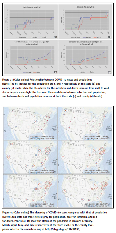
It is clear from Figure 2 that the power law distributions have different exponents. The different power law exponents indicate the different degree of heterogeneity or hierarchy; that is, the higher the exponents, the more heterogeneous the data. In this connection, the ht-index is a better indicator than the power exponent as it better reflects the inherent hierarchy. As shown in Figure 3a and 3b, the htindexes of both infection and death increase towards that of population. There is little wonder that the ht-index of the population remains unchanged – that is, 5 at the state level and 7 at the county level – indicating that the population is more heterogeneous at the county level than that in the state level (Figure 3a and 3b). This is because the population in the large areal unit of states tends to be more homogenized than that in the small areal unit of counties. According to this logic, the population in the small areal unit of cities tends to be more heterogenized than that in the large areal unit of counties. This is indeed true, as shown in the literature (e.g., Newman 2005). What is interesting for infection and death is that they have a very low ht-index of 0 or 1 at the very beginning and increase rapidly towards 5 and 7, with some fluctuation in the course of development of the pandemic. This means that lockdown policies or social distancing measures are definitely effective at containing and combating the spread of the virus; otherwise, the situation would be far more devastating than it is currently. The result shows that COVID-19 cases are largely shaped by the underlying population, seen through the increasing correlations between infection and population and between death and population (Figure 3c and 3d). In other words, two patterns shown in Figure 2 (e, f) largely reflect those of infection and death; that is, populated states and counties tend to have far more COVID-19 cases.
As elaborated above, the ht-indexes of infection and death at both the state and country levels are persistently approaching to that of population, and the correlations between infection and population, and between death and population increase also as time goes (Figure 3). This is the overall picture. On the other hand, the hierarchical levels for these three parameters (population, infection, and death) provide a much more complex and interesting picture about the pandemic (Figure 4). By examining the ht-indexes of the three parameters (population, infection and death) for individual states and counties, we can see how the pandemic hits individual states and counties differently relative to their total populations. For example, New York and its nearby states are hit most hard as reflected by the larger red circles, whereas California and Texas are affected far less, as shown by larger gray circles (Figure 4d). It is important to assess how this latest situation evolved from a dynamic point of view. For example, the situation in January and February was very mild; only five states had a relatively high degree of infection, with Washington State having the highest. The situation took a drastic turn into very wild in March, when there were suddenly six states with larger red circles, indicating that hierarchical levels of death were larger than those of population and infection. This was a dangerous sign. From March to April, and from May to June, the situation got worsened, with a few exceptions such as Washington State. These are the new insights that are developed from the state level. The same insights can be seen at the county level, and the reader can refer to or further explore the animation map as cited in the note of Figure 4.
Implication
This study has an important implication for power-law-related studies. The distributions of many natural and societal phenomena follow a power law over a wide range of magnitude, which has been extensively studied in a variety of scientific fields, such as physics, biology, economics, geography, demography, and social sciences (e.g., Bak 1996, Newman 2005). Surrounding a power law distribution and its variants such as lognormal and exponential, an increasing number of research works have been made to illustrate what is the appropriate distribution for a real-world data. The first author of this paper has long developed an argument that a power law is an idealist status, when a complex system becomes mature or well-developed (Jiang and Yin 2014). Before the idealized status, the system is likely to show some deviation from a power law, thus a less-powerlaw distribution such as lognormal or a power law with an exponential cutoff. In this regard, it is better to use the ht-index to characterize the dynamic process or evolution of the system. This study proves that the ht-index is a good indicator, apparently a better one than the power law exponent, for characterizing the inherent hierarchy or heterogeneity of a complex system from a dynamic point of view.
Conclusion
In this paper, we have found that COVID-19 cases in the United States have developed over time from a less heterogeneous state to a more heterogeneous one, or equivalently from a very flat hierarchy to a very steep hierarchy, persistently approaching that status of the populations. Thus, the COVID-19 spatiotemporal patterns are largely shaped by the underlying population patterns, i.e., well-populated states or counties tend to have more people affected or died. While this finding may seem obvious, deviations from this overall trend help us see the particularities of the COVID-19 patterns at local scales. On the one hand, the spatial distribution of COVID-19 cases is persistently approaching a power law with cut-off, despite the implemented lockdown and social distance measures, indicating enormous spatial heterogeneity in terms of the distribution of COVID-19 cases. On the other hand, the observation that the ht-index of COVID-19 cases does not exceed that of population implies that lockdown and social distance measures do indeed have some effect; otherwise, the situation would become far more devastating than it is now. The power-law-based approach enables us to uncover these interesting patterns of COVID-19 cases, so opens a new way of mapping geographic phenomena. Our future work points to this direction.
Data availability statement
The data used and generated in this study are available at https://doi.org/10.6084/ m9.figshare.13295540. The covid-19 data is based on the GitHub repository maintained by Johns Hopkins University (2020). It can be found at: https://github. com/CSSEGISandData/COVID-19/tree/ master/csse_covid_19_data. Powerlaw calculations have been done with Aaron Clauset’s MatLab code found at: http://tuvalu.santafe.edu/~aaronc/ powerlaws/. The software used to spatially process and visualize the data is ArcGIS 10.7 by ESRI. Additionally head/tail breaks have been calculated with a head/tail breaks calculator which can be found at: https://github.com/ ChrisdeRijke/HeadTailBreaksCalculator
Notes on contributors
Dr. Bin Jiang (ORCID: 0000-0002-2337- 2486) is professor of computational geography at Faculty of Engineering and Sustainable Development (Division of GIScience) of the University of Gävle, Sweden. His research interests center on geospatial analysis of urban structure and dynamics, e.g., topological analysis, and scaling hierarchy applied to buildings, streets, and cities, or geospatial big data in general. Inspired by Christopher Alexander’s work, he developed a mathematical model of beauty – beautimeter, which helps address not only why a structure is beautiful, but also how much beauty the structure is.
Mr. Chris de Rijke (ORCID: 0000-0003- 4739-7781) is a research assistant at Faculty of Engineering and Sustainable Development (Division of GIScience) of the University of Gävle, Sweden. He holds bachelor and master’s degrees in earth sciences and economics, and recently a master’s degree in GIS. He has been researching on living structure and topological analysis supported by the novel concepts of natural cities and natural streets using big data such as OpenStreetMap data, nighttime imagery, and social media data.
Acknowledgement
This paper is reprinted from the openaccess paper (Jiang and de Rijke 2021) with permission of the publisher Taylor & Francis. We would like to thank the anonymous referees for their valuable comments and Dr. Aaron Clauset for his insightful discussion. This paper was partially supported by the Swedish Research Council FORMAS through the ALEXANDER project with grant number FR-2017/0009.
References
Bak P. (1996), How Nature Works: the Science of Self-organized Criticality, Springer-Verlag: New York.
Clauset A., Shalizi C. R., and Newman M. E. J. (2009), Power-law distributions in empirical data, SIAM Review, 51, 661-703.
ESRI (2020), COVID-19 GIS Hub, https:// coronavirus-disasterresponse.hub.arcgis. com/ https://github.com/CSSEGISandData/ COVID-19/tree/master/ csse_covid_19_data
Jiang B. (2013), Head/tail breaks: A new classification scheme for data with a heavy-tailed distribution, The Professional Geographer, 65 (3), 482–494.
Jiang B. (2015), Geospatial analysis requires a different way of thinking: The problem of spatial heterogeneity, GeoJournal, 80(1), 1–13. Reprinted in Behnisch M. and Meinel G. (editors, 2017), Trends in Spatial Analysis and Modelling: Decision- Support and Planning Strategies, Springer: Berlin, 23–40.
Jiang B. and de Rijke C. (2021), A power-law-based approach to mapping COVID-19 cases in the United States, Geo-spatial Information Science, x(x), xx-xx. https://doi.org/ 10.1080/10095020.2020.1871306
Jiang B. and Slocum T. (2020), A map is a living structure with the recurring notion of far more smalls than larges, ISPRS International Journal of Geo- Information, 9(6), 388, https://www. mdpi.com/2220-9964/9/6/388, Reprinted as the cover story in the magazine Coordinates, August issue, 6–17, 2020.
Jiang B. and Yin J. (2014), Ht-index for quantifying the fractal or scaling structure of geographic features, Annals of the Association of American Geographers, 104(3), 530–541.
Johns Hopkins University (2020), COVID-19 Data Repository by the Center for Systems Science and Engineering (CSSE) at Johns Hopkins University.
Koch R. (1998), The 80/20 Principle: The secret of achieving more with less, DOUBLEDAY: New York.
Newman M. E. J. (2005), Power laws, Pareto distributions and Zipf’s law, Contemporary Physics, 46(5), 323–351.
Surowiecki J. (2004), The Wisdom of Crowds: Why the Many Are Smarter than the Few, ABACUS: London.
Zipf G. K. (1949), Human Behavior and the Principles of Least Effort, Addison Wesley, Cambridge, MA.


 (No Ratings Yet)


Leave your response!